Monday, March 2, 2009

Good vs Bad Web Design

Bad Web Design:
- Neon colors everywhere
- No navigation bars
- No easy way to tell what to do
- Makes the reader have to do too much work
- Ads everywhere in random places
- Text overlapping pictures, pictures covering text
- Goes too long without the reader getting any info
- Random music you can't turn off, worse if it has nothing to do with the content of the website

Good Web Design:
- Easy to read text
- Navbars that are easily accessible
- You can figure out what to do easily
- No ads, or ads that are fairly out of the way
- Small chunks of text
- Pictures used when necessary and add to website content
- Immediately find what you need
- Plain background that doesn't distract the reader

Monday, February 23, 2009

Diverse Group

1. Jessica and I are seventeen, and Lucas is fifteen, and Jessica and I are seniors while Lucas is a junior.  Jessica and I are also girls, and Lucas is a guy.  As for ethnicities, Jessica is Chinese, Lucas is Mexican/French, and I am Jamaican.  Jessica is Christian, and Lucas and I are not religious people.  Lucas has both parents in the household and has an older sister, Jessica's parents are divorced with two siblings, and my parents are separated and I am an only child.  Jessica speaks Cantonese, Lucas and I speak only English.  Jessica and I live in San Francisco, Lucas lives in South San Francisco.  Jessica and I have piercings.

2. We are all human beings, we are all in Upper Division, we all wear corrective lenses.  We are all right handed.  We all went to preschool.

3. Jessica is very artistic and creative and knows Photoshop, and Lucas is very tech-savvy and knows Flash.  I am Group Glue.

4. A challenge that I bring is that although I can try to keep the group on track, I can get distracted as well.  Jessica is not tech-savvy.  Lucas can also be easily distracted and is a "general nuisance".

Thursday, February 12, 2009

Progress Post


Almost done, I'm just going to play around with brushes and fonts to make it look prettier and less choppy.  I'm almost there!!


Monday, February 9, 2009

Reflection: Tools and Technique

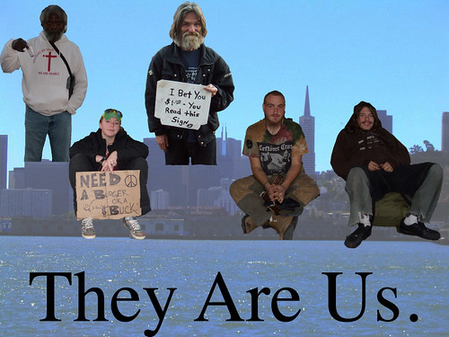
In the beginning of this project I borrowed a digital camera to take pictures of the people I was going to use for my project.  Once I had all the people, I uploaded the pictures to my school account.  To put together my collage, I used the Quick Selection tool to help me cut the background out of the picture so I only had the person in it.  I then found a photo of San Francisco to use as the collage background, and used the Move tool to drag the photos over this new background.  While revising, I created a duplicate of my background in Photoshop and put that in front of everything else so it would cover everything up.  Using the Quick Selection tool again, I selected all of the area above the skyline of the background, and that would be the area that I would have the people peek through.  I used the Move tool to arrange the images of the people so that they would appear to be a part of the skyline, kind of peeking through.  I also put a layer mask over the layers that had the pictures of the people in them, so that I could use the Paintbrush to paint black over parts of it so I could successfully fade the people into the picture like I originally wanted to do.

Monday, February 2, 2009

Progress Post


It looks awful right now, but I'm in the process of making a duplicate layer and using a layer mask to gradually fade the people into the picture.  Hopefully it will make it look more natural and polished than just having them sticking out in the middle of the photo.


Thursday, January 15, 2009

Monday, January 12, 2009

"Connecting my Project to my Definition of Art"

Art is defined for me as something that is meaningful and deliberate from the artist.  It has a message that the artist wants to send to the viewer.  What art isn't is something made just for its face value.  You can paint a pretty rainbow just because it's pretty, or you can paint a rainbow that symbolizes the diversity you'd like to see around you.  For me, the artist's intent contributes almost as much as the visual piece itself.

My project is a good definition of what I think is art because I want people to see what I see.  I want them to see how life is on the other end of the spectrum.  I have a message to send, and it's this: "Look at your fellow man.  They are us.  We all deserve better."

Since I want my pictures to be in black and white, I want them to be kind of stark and somber looking.  I want to catch the viewer's attention, make them have to get used to what they see.  The most difficult part of my project has been actually starting, because a) I've been sick and missed half a week of taking pictures, and b) I can't figure out a respectful way to take a homeless person's picture, because they might not appreciate it, get angry, or just not want me to do it at all.  I think I will get it done soon, though.  Either that, or I will have to come up with another concept for my project.